

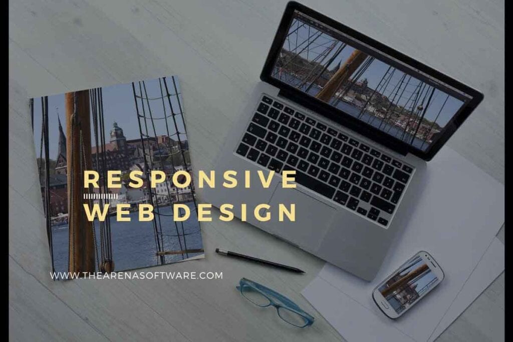
How Responsive Web Design works
Today I am going to discuss how website responsive designs can be created by using different techniques and which is best for presence of your business. You can choose mainly from two kinds of responsive layouts. Fluid media layouts and we also have some mobile specific versions these days called as accelerated mobile pages so let’s start.
How Media Queries work for Responsive Website Design
Media queries they always relate to the CSS styling or rendering and can be like conceptualized in a very series of conditional logic related to device it is being built on and on the other hand if you talk about fluid layouts they affect the structure of the CSS of website it controls the layout and therefore how it displays on a device and it can be customized completely.
How Fluid and Fixed Width Layouts work in Responsive Website Design
Previously the websites were with a very much fixed layout and proportionate. It was like a print media or any other advertisement. We not used to do those things dynamic sized presentation as it was not there before but now web sites can grow twice. So today instead of using for example a fixed width designers have started using percentage for example you want some container with 300 pixels on a desktop screen that makes around 35% to 30% of the screen size so instead of giving 300 pixels nowadays what designers do they give 30% which is great serves a purpose and whenever someone switches a device and access the same thing the look and feel goes dynamic as per the device and giving a better user experience on every device instead of just giving a fixed size which is not acceptable these days in the industry. But some things are there which need to be always in the fixed size they cannot be in ratio what do you think we will discuss later in this article.
This is why when you resize window website elements shrink elements or expands you might be thinking why it is happening well I’ve given you the answer above. This is for your own good for the business for the user. The better the user experiences the more great it makes to the business and the designers effort is always being appreciated for the work done.
Media Queries work in Responsive Website Design
So what is media queries it is a set of questions in discussion which happens between the device and the browser website is being viewed on you can treat this as a smart casual way and uniform and mobile might be better with formal version for the visitor so depending on the situation it is all taken care by having a sync with the browser.
If I go back to the relationship with the fluid design it always comes in handy when proportioned her has become too small to be ideal for this device it is being viewed on and actions become big or maybe change their position this all happens with the change in the layout to adjust As for the device so that its element can expand on contract their promotions accordingly abortions accordingly for example media queries can say if the device screen is less than 600 pixels wide display its version so for column layout it just 22 column layout or maybe one column layout or maybe 3 column layout depending on the device media query takes care of all that which is very good.
Media Queries efforts required for responsive website Design
Every other day when the designer checks the website he feels like adding something because of the change in the trend of latest designs or something if he likes. Making new formats as it keeps the responsive look fresh.
More the website is responsive the better is for the user as well as your business so you should focus on media queries to make things possible. But in today’s world everything can’t be responsive for example a banner which need to display some message it cannot be created responsive we have to keep it fixed so that it displays well on every device for example if you have a banner on the website maybe homepage which is with 50% ratio and don’t be doing that same banner for the same website on a smaller device we still keep the banner with just a 50% ratio it will be a bad user experience we have to drop the content with the banner below the banner so that banner can be displayed on the full size we’ll call it better visibility to the user and give it great user experience.
Testing time and costs for Responsive Website Design
A website design needs to be responsive designer have to work for multiple desired devices or their sizes in the main so that it can be responsive and best visible on most devices fully used a browsers commonly used then today. So tester has to also spend time checking on various devices so he or she has to play around. His work increases cost for website and sometimes also a limit when the business is starting so the best approach is you can make a couple of elements responsive which are very much important for the website to be displayed on mobile devices and others and can be mobile optimized on later stage.
There are a couple of functionalities which are very complex and important for the operation of the business so it is very much worth to be very well detailed design while making it responsive and do confirm it with the client.
At the early stages of the business sometimes budget is very much limited. So an affordable website design is always suggested for the client so that his business grows and with the growing business he can further add value into the design .It is the functionalities which maters but yes today mobile devices are being preferred to view web more than desktop devices so we have to be prepared with many strategies which we can implement when someone comes to us for a website design implementation keeping in mind the cost for it which functionalities can be and must be responsive and which functionality’s will look ok without responsive design we have to figure out something in between to give the best for the business.
Future of Responsive website design.
One of the change which has become apparent these days in website design trend is the prevalence for the touchscreen friendly components buttons are now larger tables unless common navigation’s are less complex videos and forms are embedded rather than popovers or lightboxes.
The other change which is mainly due to the adoption of mobile first approach vertical scrolling. As this is just a natural action on the mobile browser and now a lot of websites oriented themselves around vertical scrolling rather than side-by-side navigation we can make it a long scrolling page with a great responsive adoption and its mobile friendly design which can be accommodated in the shorter versions on desktops.
So what I’ve been thinking is let’s give our clients the best that we can deliver and given the best suit for their business to do that follow the tips you will get a lot of help in taking decisions while creating your designs for your web portals or any web development application.
